[2026]
Esculab – transforming a lab service into a wellness product
An online laboratory service that helps people choose the right tests, understand their results, and manage their health proactively.
Industry
HealthTech, Wellness, B2C
Platforms
Mobile
My Role
Lead Product designer
Timeline
5 months

How we transformed a transactional lab testing service into a wellness tool people return to
[Project Background]
Esculab pivoted from a reactive, doctor-prescribed model to a proactive wellness brand, redesigning a high-friction experience to boost order value and retention.
[Team & My Role]
A client project for Projector Institute's Product Design course, delivering research, UX recommendations, and a redesign. Led a 4-person team, owning UI direction and key features.
[Business Goal]
Increase Average Order Value (AOV)
Enhance Retention and LTV
Capture the Wellness Market
Reframed Esculab around three growth goals: better discovery, higher AOV, and stronger retention.
Redesigned test discovery with search, health-based categories, Quick View, and comparison.
Added panel recommendations to encourage higher-value purchases.
Extended the experience beyond results with biomarker trends, health history, and reminders.
Led the UI direction and key product concepts across a 4-person design team.

Stakeholders interviews
UX audit
User interviews
Field studies
Card Sorting
Competitor analisys
User flow
Wireframing
AI Prototyping
Visual design
Usability testing
How might we help users find the right tests without requiring medical knowledge — and reduce drop-off before purchase?
Problem:
The catalogue was structured around medical terminology rather than how patients actually search, creating friction and drop-off during discovery.
Solution:
We ran a card-sorting exercise and rebuilt the taxonomy around a Jobs-to-Be-Done framework, cutting categories down to two:
Search for a known test
Explore by health concern
Outcome:
A simpler discovery model that better matches user intent and shortens the path from exploration to purchase.
Before
Medical jargon and fragmented categories created friction during test selection.
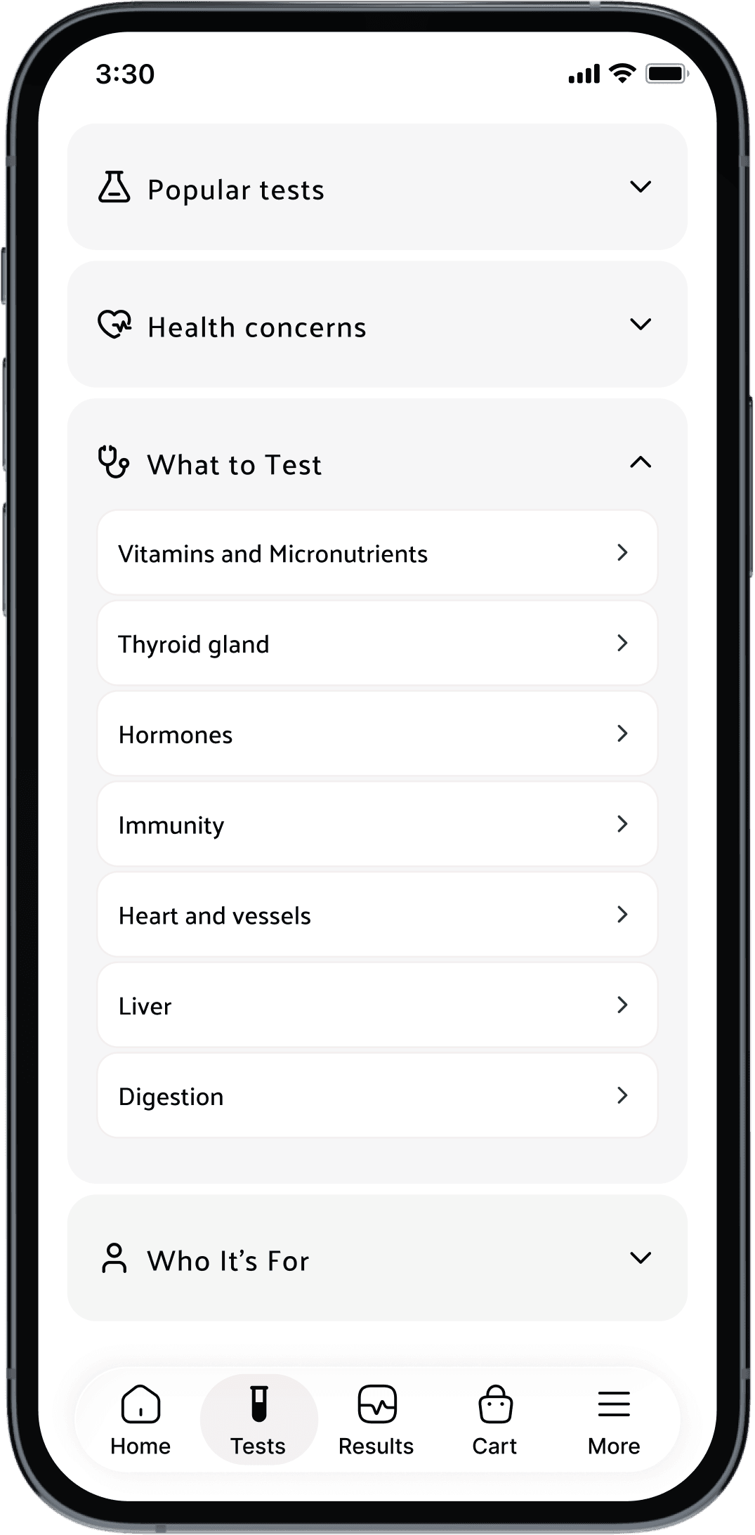
After
Replaced medical-first navigation with symptom and goal-based categories.

After
Quick View feature surfaces key details right in search results, no need to open each product page.

How might we increase AOV by shifting users from individual tests to higher-value panels?
Problem:
Panels looked like pricier alternatives, not more complete checkups — with no context on their added value.
Solution:
Added side-by-side test/panel comparison, contextual recommendations, doctor-interpretation services in the purchase flow, and panel promotions at every key decision point in the catalogue.
Outcome:
A stronger path from single tests to higher-value panels, with the potential to increase panel adoption, basket value, and overall AOV.
Before
Users had no way to compare tests and panels, making it difficult to understand differences in coverage, biomarkers, and overall value.


After
Comparison feature lets users view tests and panels side by side to quickly understand differences in price, included biomarkers, and coverage before choosing an option.

Before
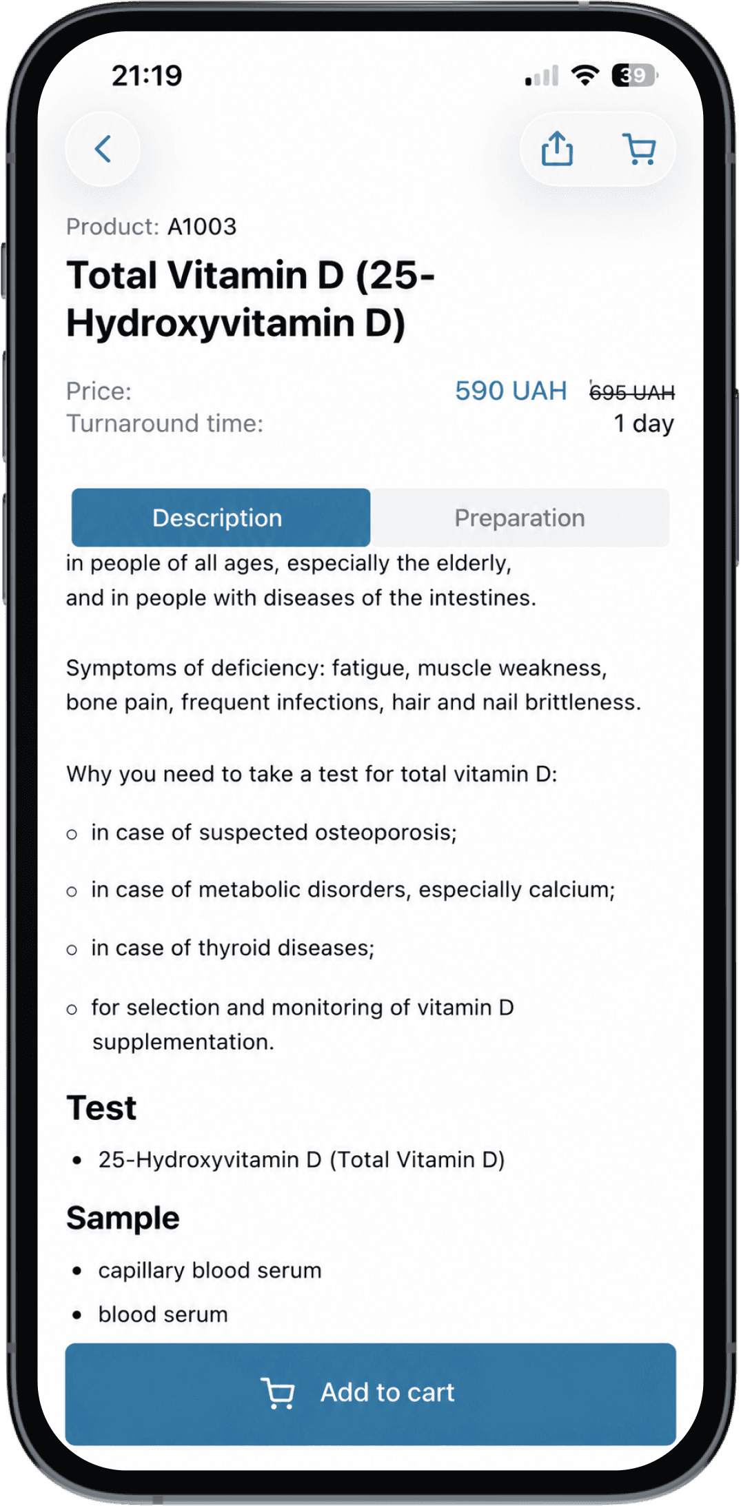
No panel promotion, no visible benefits why choose panel instead of test.
After
Organized test details by user needs and promoted doctor interpretation services.
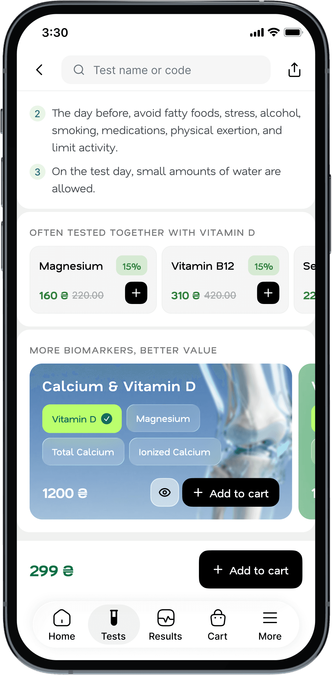
Recommended tests that are often ordered together with the selected one.
Highlighted a panel containing the selected test and extra biomarkers available at a lower bundled cost.
Challenge 3 / Build retention beyond the test
How might we create ongoing value after results are delivered, giving users a reason to return, track their health, and test regularly?
Problem:
After results arrived, users had no reason to return — the account was just storage.
Solution:
Added biomarker trend charts, clearer result context, and retesting reminders to turn Esculab into an ongoing wellness tool.
Outcome:
Designed to improve repeat purchase rate, return rate, testing frequency, and lifetime value — turning one-off results into an ongoing wellness experience that drives repeat orders and preventive testing.
After
Result Dynamics shows how biomarkers change over time, highlights movement in and out of range, and summarizes key changes between tests.

Moved away from clinical blue to support the shift from lab testing to wellness. Green feels more connected to health and prevention, making the product feel less transactional and more like a tool to return to regularly.
Discoverability
Task completion
Time on task
Error rate
Value perception
Conversion potential
Outcome:
After 3 rounds of moderated and unmoderated (via Maze) usability testing, users were able to find relevant tests faster, understand key actions like Quick View and Compare, and add items to cart with less friction.
A selected example from multiple tested flows
First testing


Second testing

Final testing

Added a clear “Compare” label to make the action immediately understandable.
Replaced the ambiguous "Quick View" icon with a familiar eye icon.
Handed off with a complete Figma redesign, usability insights, and UX documentation, giving Esculab a validated direction for discovery, panel adoption, and the wellness experience. Rollout is underway gradually, with results to be measured after full release.

