[2025]
Trace Tasks – to-do-list app with ai verification
A cross-platform operations product that helps distributed teams assign work, collect photo evidence, and verify task completion with AI.
Industry
Task Management
Platforms
Mobile
My Role
Product designer
Timeline
4 months

[Project Background]
Trace Tasks was pre-launch when I joined. I helped evolve it from a conventional task manager into an AI-assisted verification product.
Core model: Manager assigns → Worker completes → AI verifies → Manager handles exceptions
[Business Goal]
Reduce manual supervision by automating routine verification.
[Product opportunity]
What if completing a task could also verify the work?
We explored how AI-powered evidence could turn task completion into a reliable feedback loop for both workers and managers.
TL;DR
Joined Trace Tasks before product launch and helped reshape the initial concept into an AI-assisted task-verification product.
Rethought the worker experience around task requirements, evidence submission, and immediate verification feedback.
Defined clearer task types so workers could understand what was required before opening a task.
Validated key interaction decisions through prototype testing before development.

How I approached it
Stakeholders interviews
UX audit
Competitor analisys
User flow
Wireframing
Prototyping
Usability testing
Visual design
Before

After

Challenge 1 / Build verification into task completion
Problem:
The initial concept focused on task completion, but marking a task Done didn’t prove the work was actually completed correctly.
Managers still had to verify it manually.


Problem-solving process:
We reframed completion from a final state into a verification loop:
We explored: Task → Evidence → AI verification → Result → Exception if needed
Solution:
Workers submit photo evidence, which AI checks and classifies as:
Verified - evidence meets the requirement.
Needs attention - evidence is insufficient or something needs to be corrected.
This made AI part of the core workflow rather than a standalone feature.
Challenge 2 / Make different task requirements immediately clear
Problem:
Simple and evidence-based tasks looked too similar, so workers only learned what was required after opening them.
Problem-solving process:
I explored and tested different combinations of color, icons, labels, and states to move that information earlier in the journey.
Solution:
I introduced distinct task types:
Simple task - finish with one click
Evidence task - photo submission required
Blocked / attention state - something needs to happen before completion

Clear task types at a glance
Simple tasks
Tasks requiring evidence
Blocked tasks
Validation through fast testing
We used guerilla testing with interactive prototypes to see whether users could distinguish task types at a glance.
Testing focused on how well color, icons, and labels communicated different task requirements.
Users responded positively to the color distinction, confirming it as a useful supporting cue for faster scanning and recognition.
Completing simple task
Green connects simple tasks across the flow, helping users recognize tasks that require no evidence.
From the task list
Complete simple tasks instantly with one tap on the green icon.
From task details
Open the task to review details, then complete it from the task page.
Completing task with evidence
Blue connects evidence-based tasks across the flow, helping users recognize when proof is required before completion.
From the task list
Tap the blue icon to add photo evidence and complete the task without opening it.
From task details
Open the task, review the requirements, add evidence, and complete it from the task page.
Challenge 3 / Make an operational product pleasant to use daily
Problem:
The initial UI felt too strict and utilitarian for a product workers would use throughout the day.
Visual direction:
I moved away from traditional workforce software and defined a friendlier direction around:
Friendly · Calm · Lightweight · Colorful · Non-intimidating
References:
I explored consumer and productivity products, focusing on soft gradients, rounded forms, playful details, and selective use of color to shape a more approachable visual language.

Visual Iterations
Early explorations used bold gradients and saturated color. They gave the product more personality, but made the interface feel too busy for frequent use.
I kept the playful character while reducing the visual intensity.
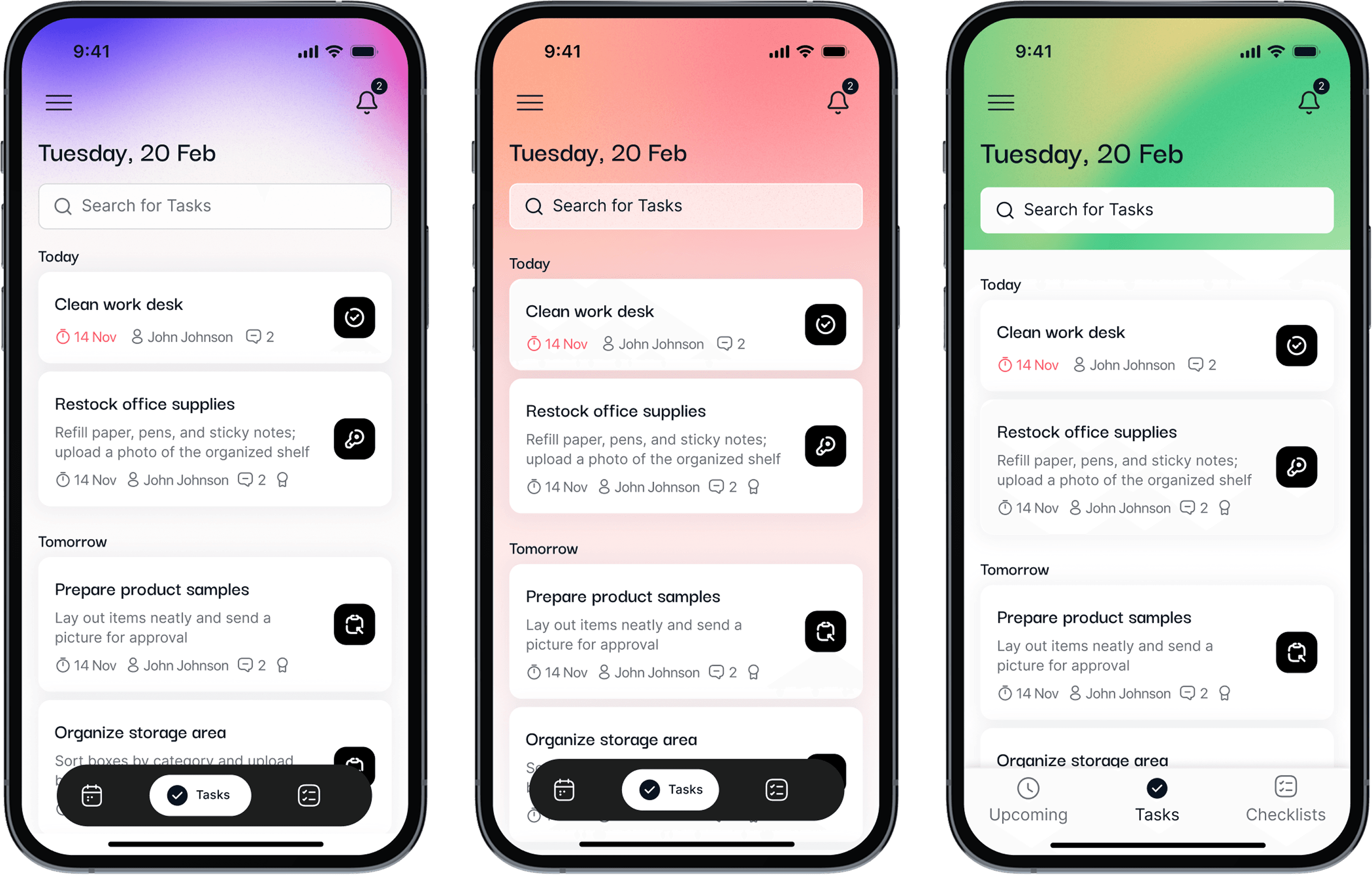
Final version
I gradually reduced the visual intensity while keeping the personality — moving toward calmer backgrounds, softer gradients, rounded components, and more intentional use of color.
Manager creates checklist

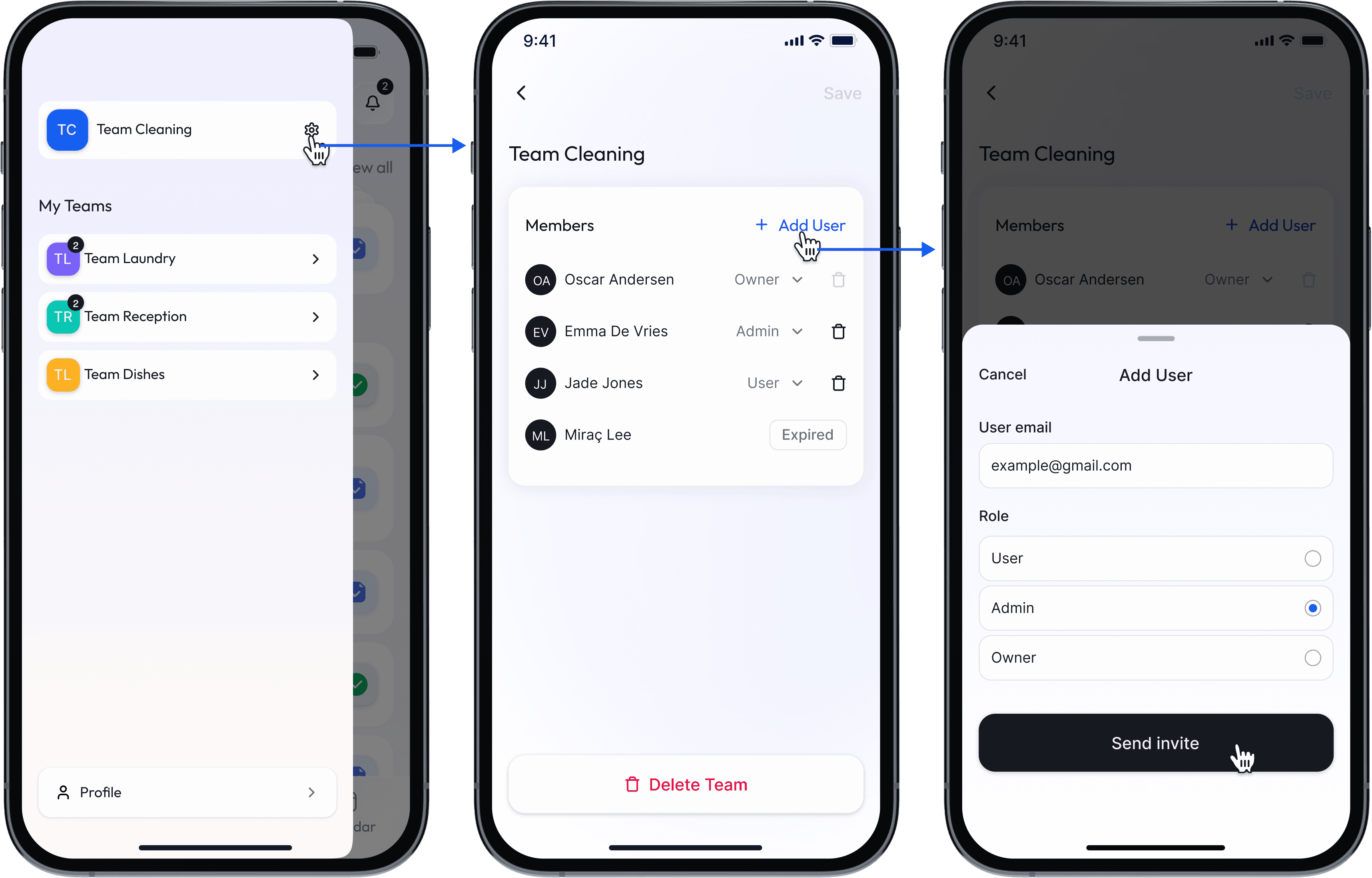
Manager adds user to the team
Worker finishes simple task

Worker finishes task with evidence

Designing a separate web admin panel
We used the existing design system and Bolt to accelerate the manager admin panel instead of designing it from scratch.
This reduced design and development effort while keeping the experience consistent and scalable.
Accessibility as a baseline
The colorful UI still followed key WCAG principles: sufficient contrast, clear labels and focus order, and no critical state communicated by color alone.
Design system & development alignment
For the React-based cross-platform app, we used Shadcn/ui as the design-system foundation and customised components in Figma to stay closely aligned with development.

