[2024]
Purlos – transforming a support-dependent platform into a self-serve product
A British B2B EdTech engagement platform that helps universities communicate with students through WhatsApp, email, surveys, and automated campaigns.
Industry
Engagement, EdTech, B2B
Platforms
Web
My Role
Product Designer
Timeline
6 months

How we transformed a complex EdTech platform into a tool universities can use on their own
[Project Background]
Purlos is a UK EdTech product with strong functionality, but campaign creation was difficult to use without support, limiting client independence and scalability.
I worked with the product team to rethink the core workflows and move the platform toward a self-serve model.
[Business Problem]
Purlos’ service-heavy model couldn’t scale efficiently. Clients relied on the internal team for campaign setup and ongoing support, consuming resources that could otherwise support growth.
[Business Goal]
Turn Purlos into a self-serve product so it could onboard more clients without scaling support costs at the same rate.
Redesigned Purlos, an EdTech engagement platform, to shift from service-heavy to self-serve for universities.
Identified core pain points: overwhelming one-page campaign setup, lack of feedback, unclear analytics, and clunky communication tools.
Introduced solutions: 4-step guided flow, Kanban/List roadmap, actionable dashboards, AI replies & templates in Queries, and design system.
Collaborated closely with PM, QA and developers to design within Salesforce constraints while meeting accessibility standards (WCAG).
Stakeholders interviews
User interviews
UX audit
Competitor analisys
User flow
Wireframing
Visual design
Usability testing
How might we help clients create campaigns independently without relying on support?
Problem: Low adoption
Campaign creation lacked clear order, progress, and feedback, so users relied on support to avoid mistakes.
Approach:
I restructured the entire workflow around clear stages, requirements, progress, and next actions.
Solution:
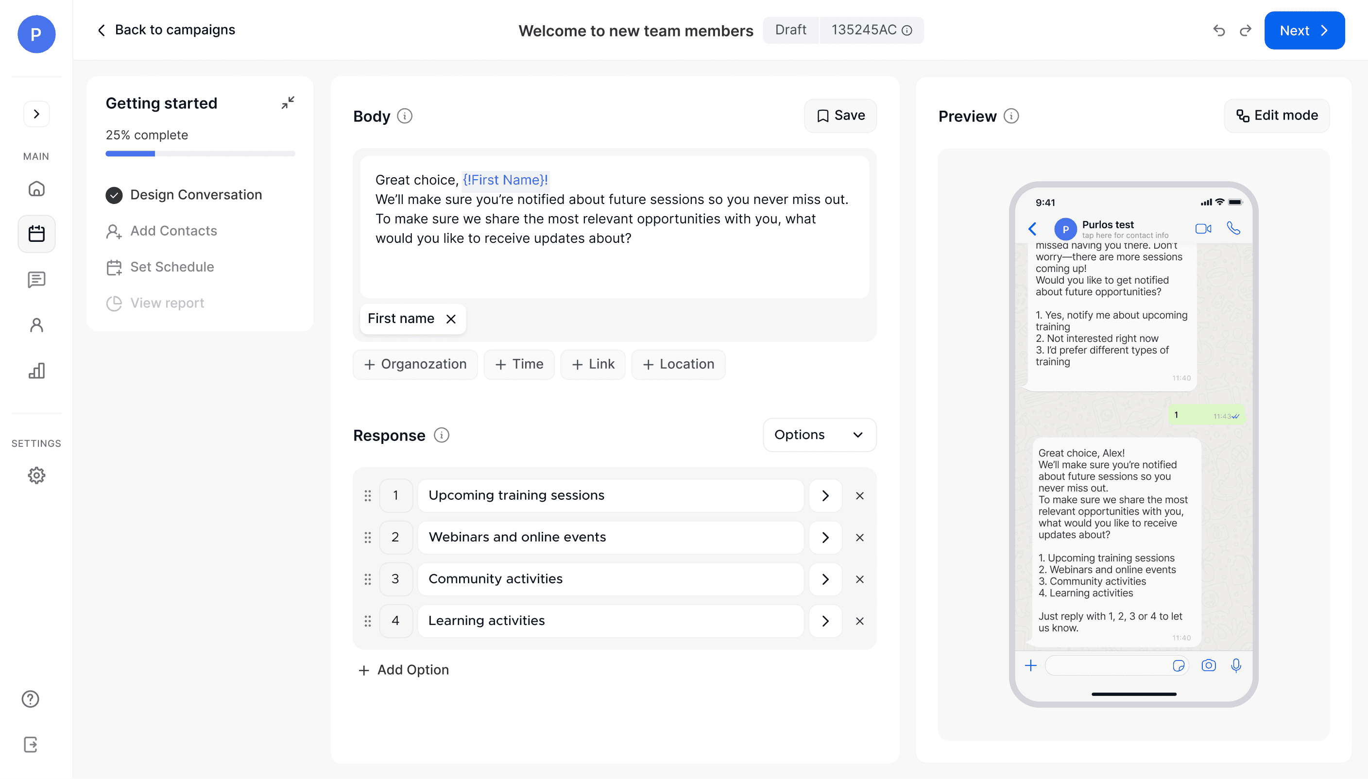
A guided four-step flow for message creation, contacts, scheduling, and review/testing, with validation and contextual guidance.
Outcome:
Users could create campaigns independently, reducing support dependency and enabling Purlos to move toward a self-serve model.
Before
One page with all steps mixed
No confirmation / status change after uploading contacts or scheduling

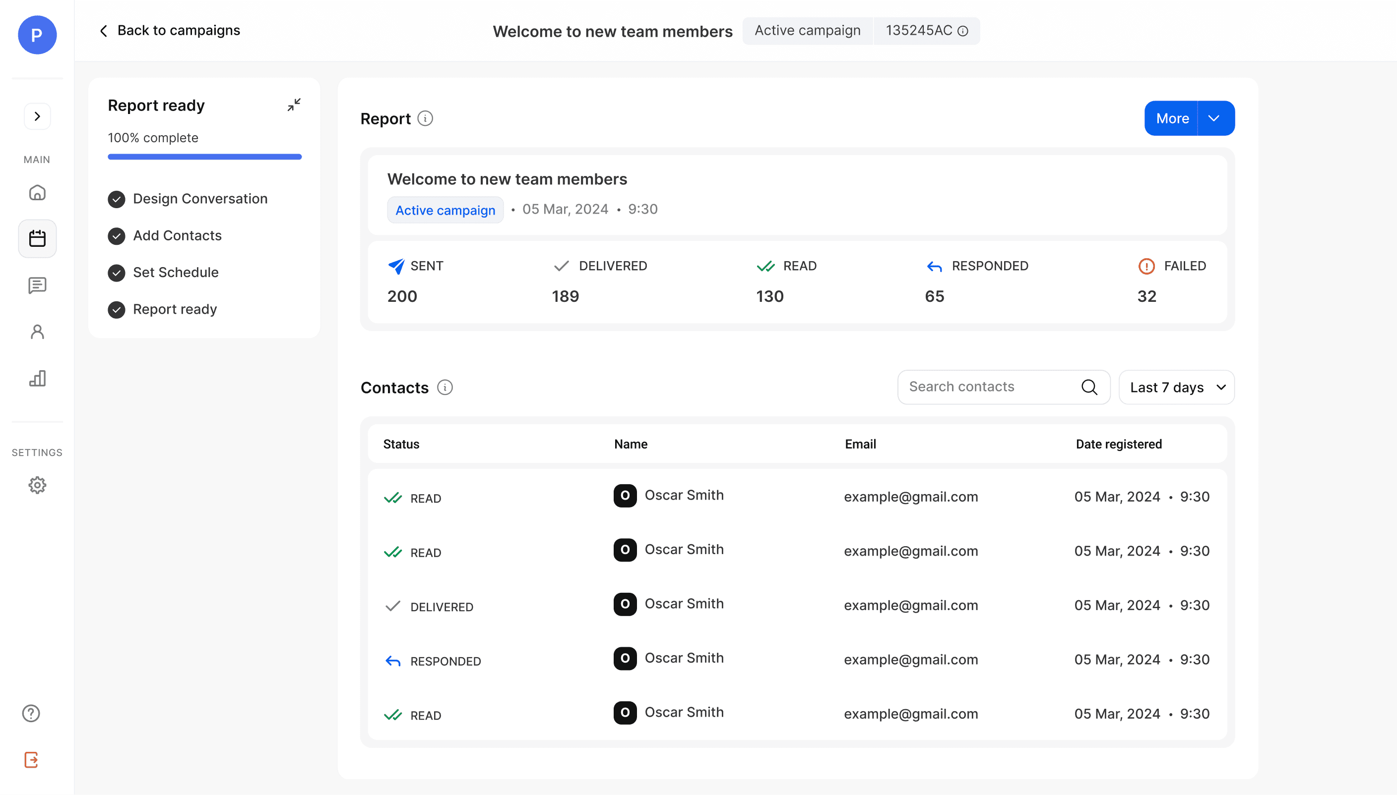
After: flow split into 4 clear steps with progress bar
Step 1 / Conversation creation
Step 2 / Adding contacts

Step 3 / Setting schedule

Step 4 / Analytics overview
Additionally, I redesigned the Flow Builder to support self-serve campaign setup.
Previously, users could only edit messages in a preview mode. I changed the logic so they could build and edit conversation flows directly in the builder.
Before

The tool didn’t serve its role. In fact, they only opened it when an error occurred — it was the only way to check at which step the problem happened.
After
I redesigned it into a flow-style conversation designer

Users only need to click on a conversation card to open and edit it, with full ability to create, adjust, and preview messages step by step.
How might we help users quickly understand campaign status and what needs attention?
Problem:
The planning dashboard showed campaign information, but made it difficult to scan what was scheduled, running, or completed.
Approach:
I reframed it around three questions: What is happening? What is the status? What needs action?
Outcome:
Users could understand campaign status and take routine actions with less navigation and cognitive effort.
Before

Too many CTAs competed for attention, including rarely used actions.
Card actions like copy and delete were hidden in a page-level menu.
After
Quick actions (delete, copy, select) appear on hover, giving users direct control.

All secondary CTAs were put into a single button, reducing visual noise and keeping focus on key actions.
Campaigns are organized by month and week, with clear statuses (Draft, Scheduled, Sent etc.) and contact counts visible on each card.
Challenge 3 / Making high-volume conversations manageable and easy to reply to
How might we help users handle more student conversations without losing context?
Problem:
Interviews and a UX audit showed that conversations were cluttered, context was easy to lose, and repetitive questions slowed users down.
Approach:
I structured the workspace around three layers:
Conversation list → Active conversation → Student context
Solution:
I introduced clearer hierarchy, persistent student and campaign context, reusable responses, and AI-assisted reply suggestions.
Outcome:
Conversations became easier to scan and resolve, reducing repetitive work for teams managing high volumes of student communication.
Threaded chat-style view makes conversations easy to follow.

Each part of the page has a clear role (inbox, conversation, details), which makes the workflow predictable and intuitive.

AI reply integration: Users can insert suggested replies generated from the institution’s knowledge base.
Business outcome
The redesign helped Purlos move to a more self-serve model.
New clients could manage campaigns more independently, reducing day-to-day support needs. As demand decreased, Purlos was able to restructure parts of the support team into other roles and redirect resources toward growth.

